SaaS Landing Page Copywriting for High-Intent Keywords
Match your headline to the keyword's intent, not your product's features.

SaaS landing pages convert at a median of 3.8%, per Unbounce's 2024 Conversion Benchmark Report. The all-industry median sits at 6.6%, so SaaS is underperforming almost every other category selling something online. I've stared at enough of these pages to have a theory: the gap comes from a mismatch between what the keyword told you about the visitor and what the copy actually delivers once they land. The words are doing more work than most teams give them credit for, and usually doing it badly.
What high-intent keywords actually reveal about a visitor's buying stage
B2B buyers finish roughly 70% of their purchase decision before they talk to a vendor. 6Sense's 2024 research pushes that further: about 80% of the time, it's the buyer who reaches out first, ahead of any sales rep cold-calling their way into a deal. So the person clicking your ad has already read the reviews, formed opinions, and shown up with a specific question in mind. Answering that question is the entire job description.
Keywords sort into buckets, loosely, and each bucket tells you something different about where the visitor stands. Transactional queries like "free trial" or "[product] demo" mean the visitor is done shopping and wants a door to walk through, nothing more theatrical than that. Commercial investigation queries (your "vs" and "best [category] software" searches) mean someone's still comparing, still looking for a reason to pick one over another. Modifiers sharpen the picture: action words like demo or trial signal readiness, evaluation words like best or review signal active weighing, and budget words like price or cost mean someone's doing math before they commit to anything.
Then there's competitor and alternatives searches, probably the most underused bucket of the four, especially among newer SaaS brands still obsessed with their own homepage. Someone typing "[competitor] alternative" into Google has already diagnosed a problem with a product they're currently paying for, and they just need a reason to leave; most companies never bother giving them one.
Long-tail variants convert at roughly two and a half times the rate of their broad head-term counterparts, which makes sense once you think about it: specificity in the search is a stand-in for specificity of intent, and specific intent is just easier to satisfy than a vague one. Pull up your Search Console export and, for each term, ask what decision this person has already made, rather than what they might be curious about. That answer tells you what register to write in.
Intent runs on a gradient, not a switch flipped between "just browsing" and "ready to buy." Treat it as binary and you'll either come on too strong for someone still comparing, or feel frustratingly thin for someone who just wants to click "start trial" and get back to their actual job.
Message match: why the headline must echo the keyword that brought the visitor there
Message match, sometimes called conversion scent (a phrase I did not invent and slightly wish I had), is the thread connecting what someone clicked to what they land on. Break that thread and you get instant friction: the visitor pauses, feels a flicker of doubt about whether they've wandered into the wrong store, and a chunk of them just leave. Unbounce's data shows strong message match between ad copy and landing page headline can lift conversion by up to 39%. That's one lever, doing the work of ten.
What does this look like on an actual page? Someone who searched "project management software free trial" needs to see "free trial" and the product category in your H1, ahead of a vague tagline about unlocking your team's potential, whatever that means. Someone who typed "[brand] alternative" wants the comparison named outright; a page that opens with your founding story before it acknowledges why they clicked will lose them before the second scroll. A visitor searching "marketing automation pricing" should land on something that leads with the number, sparing them a product tour they have to sit through just to find it.
Google notices this too, for what it's worth. Message match feeds straight into Quality Score through expected click-through rate, ad relevance, and landing page experience. A mismatched page costs more per click and converts fewer of those clicks, which is the worst kind of double tax: bad economics on the ad, bad economics on the page.
The most common way teams break this rule is building one hero landing page and pointing a dozen keyword clusters at it, same headline for the trial searcher, the comparison shopper, and the budget-conscious skeptic alike. Each cluster deserves its own headline, even if the page skeleton underneath stays mostly shared. Match intent to intent, rather than parroting the search query back word for word. Within two seconds, the visitor should feel like they've landed exactly where they meant to.
How readability and word choice determine whether copy converts or confuses
Here's a number that ought to make product marketers wince a little: pages written at a 5th to 7th grade reading level convert at 12.9%, while pages written at a professional reading level convert at 2.1%, according to that same Unbounce report. That gap dwarfs nearly every other copy variable in the dataset, headline structure and CTA wording included.
Why does this happen? Professional-sounding copy tends to pack in category jargon, abstract benefit claims, and clauses nested inside other clauses, usually written by someone so deep in the product they've forgotten what it felt like before they knew the acronyms. The visitor reading that copy isn't dumb; they're busy, they're skimming on a phone somewhere between meetings, and nobody's doing the translation work for them.
There's a sweet spot for length too: somewhere between 250 and 725 words, with no more than 50 to 140 "difficult words" (three-plus syllables, by the usual readability definition). It's a range where the argument lands before attention runs out, and that matters more now than it used to, since average attention span sits around 47 seconds. Don't front-load the outcome and you've lost the visitor before you've made your case.
Headline framing compounds all of it. Outcome-driven H1s average a quality score of 58 out of 100, against 44 out of 100 for feature-driven headlines, a fourteen-point gap from one decision. And yet 62% of SaaS pages still lead with features, which means most of the market is leaving an easy win sitting right there on the table, in plain sight, un-cashed. Write the headline as the result the buyer gets: "Close deals faster" beats "AI-powered pipeline management" pretty much every time it's tested. Clear, plain-language value props lift conversion by 34%, and that's not a small number for something that costs nothing to fix.

Writing copy for each intent tier: transactional, comparative, and alternatives pages
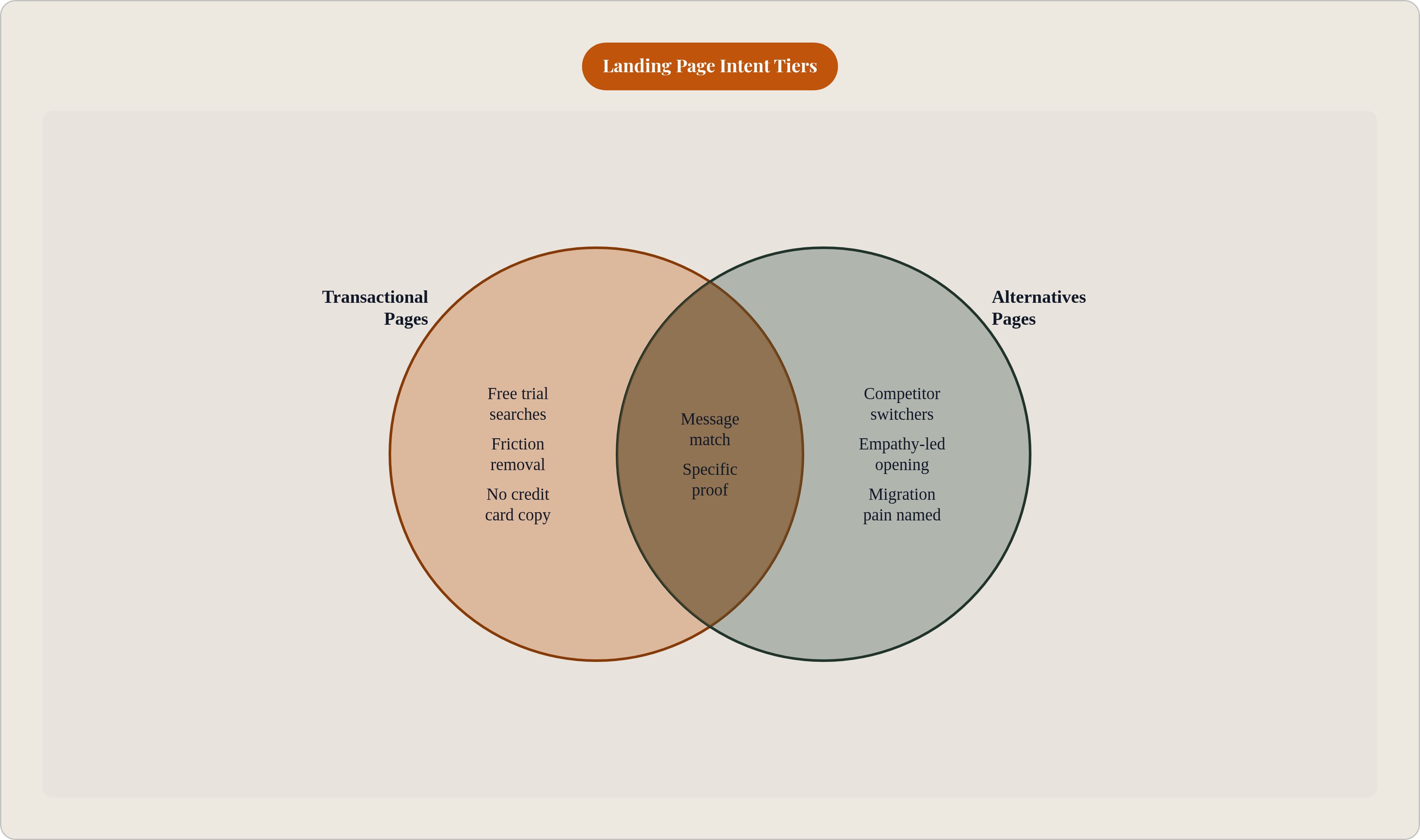
Different intent tiers need different page architectures, built around what that specific visitor already believes walking in, well beyond a different font or a new color palette.
Transactional pages, your "free trial," "pricing," and "demo" searches, serve visitors who've already made the category decision, and your job here is credibility and friction removal, full stop, nothing more ambitious than that. Lead with the offer above the fold, ahead of any feature carousel. "Start your free 14-day trial" belongs at the top, not buried under three scroll-lengths of product story nobody asked for. Kill the last objection before the CTA even loads: "No credit card required. Cancel anytime." answers the exact thing stalling someone's cursor. Social proof here should be outcome-specific, a testimonial about time-to-value or ROI, rather than a vague "we love this tool" quote that could belong to literally any product on earth.
Comparative pages, built around "best [category] software" or "vs" searches, serve visitors still deciding between options, and the copy has to actually differentiate rather than just describe. Name the comparison outright; hedging around a competitor's name reads as weakness and fails the message-match test before the page even gets going. A structured breakdown works well here: where you win, where the competitor wins, who each product is actually for. That kind of honesty builds more trust than a page pretending it has no weaknesses, which nobody believes anyway. Proof matters most on this tier, and it needs to be specific: metrics, customer names, results with context attached, not adjectives.
Alternatives pages, the "[competitor] alternative" searches, might be the highest-converting page type when built right, because the visitor is already dissatisfied and already halfway out the door. One project management SaaS company built a single comparison page that ranked first for its target "[competitor] alternative" query, generated $500K in ARR, and converted at 23% to trial, nearly four times the average SaaS landing page rate. Worth sitting with that for a second: a page category most companies haven't even built yet is quietly outperforming everything else in their funnel. The copy should open with empathy for why someone's looking to leave ("If you've outgrown [Competitor]...") before pivoting into proof the switch is worth the hassle. Name the migration pain directly, too, since that's usually the real reason someone hasn't switched already, and hoping it doesn't come up is not a strategy.
CTA copy and placement decisions that close the intent gap
Backlinko surveyed 37 companies and found a clear CTA ranks as the single most important factor in high-converting landing pages, ahead of persuasive copywriting, ahead of visual content, ahead of the hero image and the video nobody watches all the way through. The button matters most, and everything else is secondary, including the things teams spend the most time arguing about in Slack.
CTA copy needs to mirror the intent tier it's serving. Transactional visitors respond to first-person, action-specific phrasing: "Start My Free Trial." Comparative visitors need something lower-commitment that matches their evaluation mode, like "See How We Compare" or "Get a Personalized Demo." Alternatives visitors respond to language that names the switch they're already weighing: "Switch in 15 Minutes" or "See [Product] vs [Competitor]." The first-person versus second-person split isn't trivial either; "Start My Free Trial" consistently beats "Start Your Free Trial," a one-word change with a measurable, repeatable lift across tests.
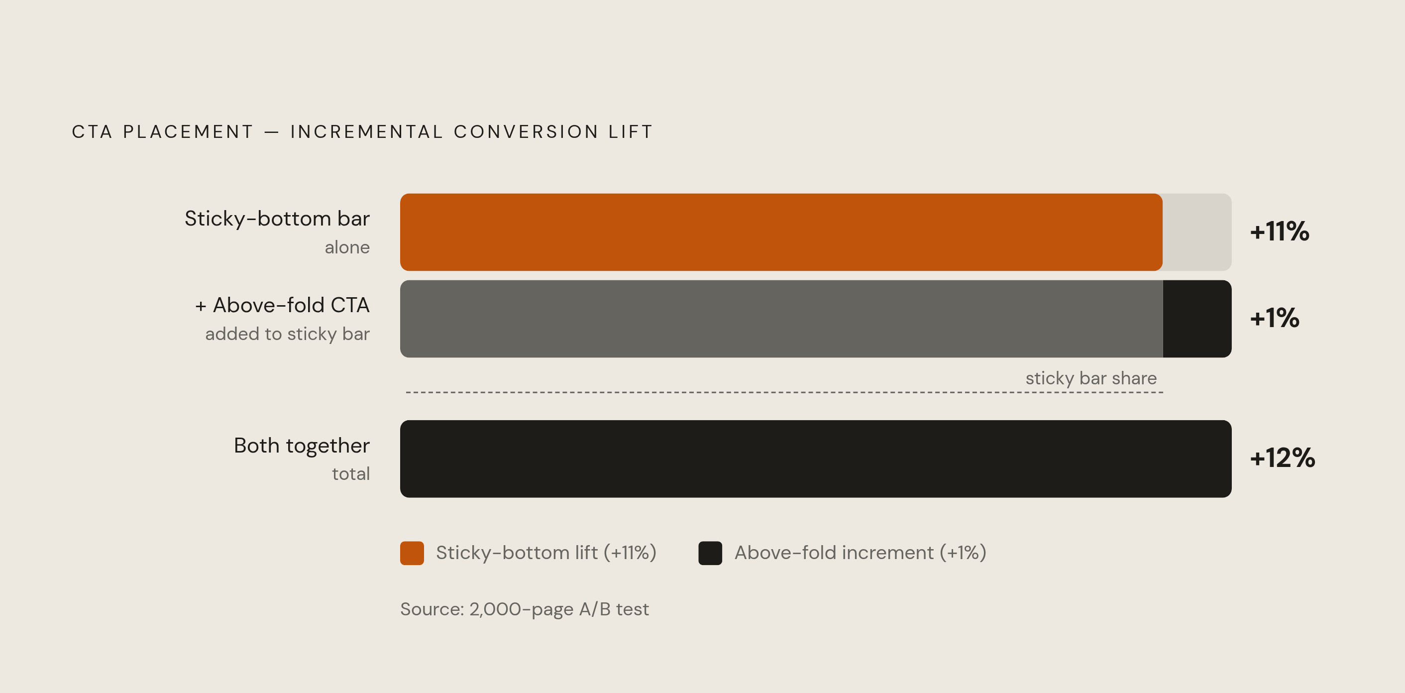
Placement data from a 2,000-page A/B test tells a story most marketers get wrong by instinct. Sticky-bottom CTAs lift conversions by 11% on their own. Adding an above-fold CTA on top of that sticky bar adds only 1% more, well short of the 17% a lot of people assume walking in. Run both together and you land at 12% total, so the compounding effect everyone expects just doesn't show up in the data. The sticky bar eats nearly all the available benefit by itself; if you're prioritizing one placement decision this quarter, make it that one and stop arguing about above-fold real estate in meetings.
Reassurance copy near the CTA, things like "No credit card required," "Cancel anytime," or "Join 5,000+ companies," works as a last-second objection handler. Small on its own, but stacked with other tweaks it's been documented to lift conversion meaningfully in aggregate. Generic CTA copy like "Submit," "Learn More," or "Click Here" undoes all of it in three words. Those three words tell the visitor, correctly, that this page wasn't written with their specific moment in mind, and they quietly cancel out whatever message match your headline just spent two sentences building.
Social proof copy that earns trust rather than just claiming it
Trust signals, taken together, can lift B2B SaaS conversion substantially. That range hides something worth pausing on, though: proof quality varies enormously, and generic proof is drifting toward worthless fast, maybe faster than most teams have noticed.
A large-scale 2026 conversion study laid out a rough hierarchy. Named-customer counts with scale or revenue context, something like "Used by 8 of the Fortune 50," produced a 22% lift, while a single strong testimonial card produced 14%, and a logo strip on its own produced 8%. Vague phrases like "trusted by thousands," with no names or numbers attached, performed about the same as showing no proof at all, since that phrase could describe literally any product ever made, including several that have since folded quietly and without ceremony.
Specificity is what makes a testimonial actually work. "We increased qualified leads by 45% in Q2" beats "Great product!" by a wide margin, and pairing that quote with a full name, job title, company, and photo pushes credibility further still. One B2B SaaS company added three named case studies with quantified outcomes to its landing pages and saw conversion rise 28% within 60 days, with no product changes and no pricing changes. The only thing that moved was proof that somebody else had already taken the risk and come out ahead of it.
Placement should follow intent here too. Logo strips and rating badges belong above the fold, in the hero, for instant credibility on arrival. Testimonials with specific outcomes belong right next to the primary CTA, exactly where the last objection tends to live and fester. Case studies with full context work best mid-page, for visitors still in evaluation mode, your comparative and alternatives crowd. Security and compliance badges belong in the footer or near form fields, where transactional visitors want risk reassurance right before they hand over an email address.
One thing worth flagging: Social proof has to be real, attributed, and something you could actually produce a receipt for if someone asked. That's an ethics question, and increasingly a legal one, and it's not one to get cute about.
Turning intent-matched copy into a repeatable production process
Most SaaS teams run one landing page trying to do the job of five. Traffic from transactional, comparative, and alternatives keywords all funnels into the same generic page, and unsurprisingly, that page converts none of those groups particularly well. It was written for an "average visitor" who has never once existed outside a spreadsheet, rather than for any of them specifically.
Everything in this piece points toward a page-per-intent-cluster setup: same underlying product, different headlines, different CTAs, different proof placement, depending on which keyword category brought the visitor there in the first place. That's more pages to manage, sure, but it's also the difference between a 3.8% median and something closer to the 11.6% top-quartile mark.
The real constraint here is rarely writing speed; strategy is usually the bottleneck, and intent mapping has to happen before a single word of copy gets drafted: keyword, then buying stage, then page type, then register. Skip that order and even the fastest AI-assisted writing tools just churn out generic copy at scale, only faster and with more confidence than it deserves.
If you're starting from one generic page and need to pick where to begin, build alternatives and comparison pages first. They target the highest-intent visitors sitting in your funnel right now, and across most SaaS content libraries I've dug through, they remain the most underbuilt page category by a wide margin, sometimes not built at all. Measure each intent tier separately too, since pooling conversion metrics across transactional, comparative, and alternatives pages hides exactly which cluster is dragging the average down, and that's the number you actually need to see before you can fix anything.
The 11.6% top-quartile threshold is reachable, but only by a page built for one specific visitor with one specific question. The "average visitor" every generic landing page gets built for doesn't exist anywhere outside that spreadsheet, and it's long past time we stopped writing to them.