Email Nurture Sequence Copy for SaaS Trial Signups
A structured seven-email sequence outperforms random check-ins on trial conversion.
Most SaaS companies still onboard trial users with one welcome email and a prayer that a customer success manager gets around to a follow-up call. According to SEG's 2025 SaaS Report, 61% of SaaS companies run exactly this motion. That's not a staffing shortage; it's a failure to see nurture sequences as something other than a polite series of check-ins. This piece maps out what a real trial sequence looks like: seven emails, each with a specific job, moving a user from uncertainty to competence to commitment.
A "check-in" email, when you strip away the friendly tone, says one thing to the user: we have no idea where you are in this product or what you actually need right now. That's the whole problem in a sentence. A structured sequence replaces that guesswork with a psychological arc, and each email earns the right to send the next one. Skip a stage, and the logic underneath the whole thing collapses like a lawn chair with one leg missing.
What the conversion data actually says about when and why trials fail
Start with timing, because timing is the one lever copy can actually pull. ChartMogul's analysis of 2,500 companies found the median daily conversion rate sits near zero for almost the entire trial period, then spikes at the very end. After day 14, conversion on any given day drops to roughly 1%. Read that carefully: users aren't converting when they feel ready. They're converting when the clock runs out and they're forced to decide. That means a sequence's job isn't to wait around for readiness; it has to manufacture urgency before the deadline arrives, not scramble to react once it does.
The median B2B SaaS trial-to-paid conversion rate sits at 18.5%, per Baremetrics, while the top quartile converts at 35 to 45%. That gap is enormous, and it's tempting to credit it to product quality. But is that really the driver? The more boring explanation, and the one the data supports, is that top performers run a structured activation and conversion sequence while everyone else sends sporadic check-ins.
Opt-in trials, meaning no credit card required at signup, make up 68% of SaaS trials, and they convert at meaningfully lower rates than opt-out trials that require payment info upfront. First Page Sage puts opt-in conversion at 18.2% against 48.8% for opt-out. A separate ChartMogul study of 200 products lands on different absolute numbers, but the directional gap holds across both. The practical takeaway for copywriters: someone who signed up without entering a card made a lower-commitment decision, so the sequence has to do more persuasive lifting to close that gap. Which raises the next question: if urgency has to be built rather than discovered, when does the building actually need to start?
The 72-hour activation window that the entire sequence is built around
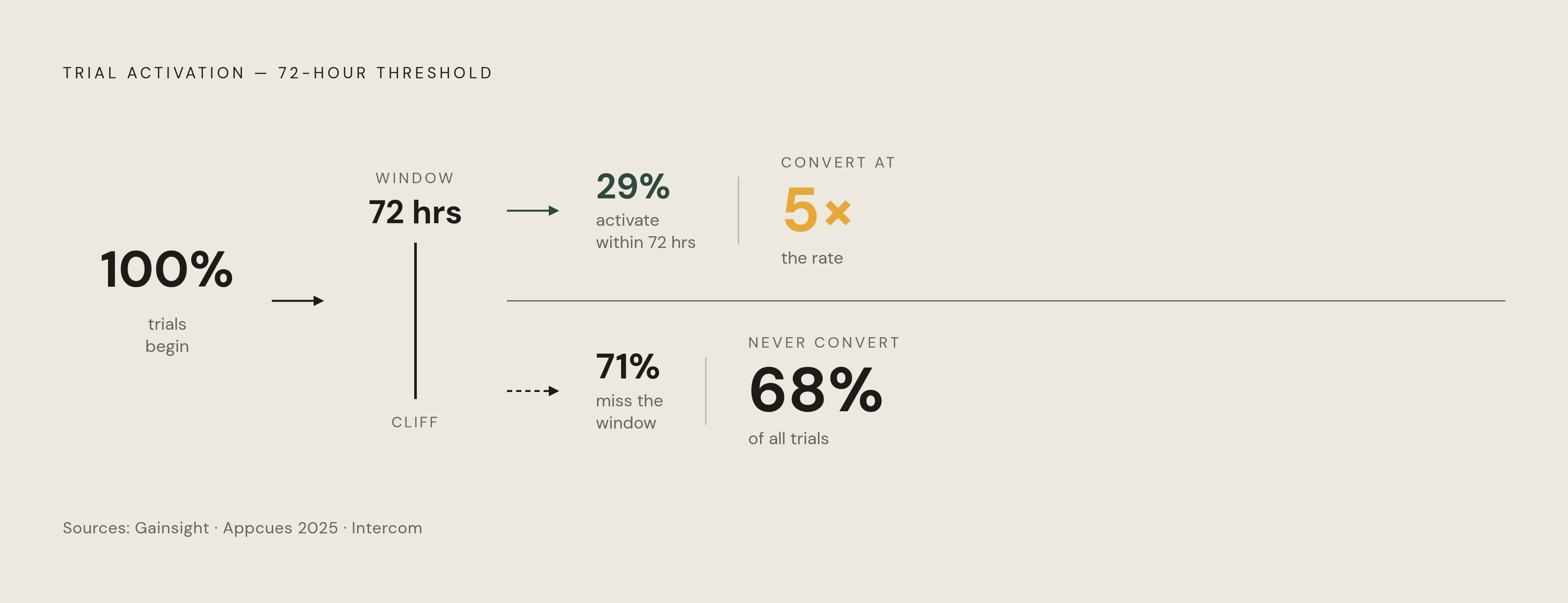
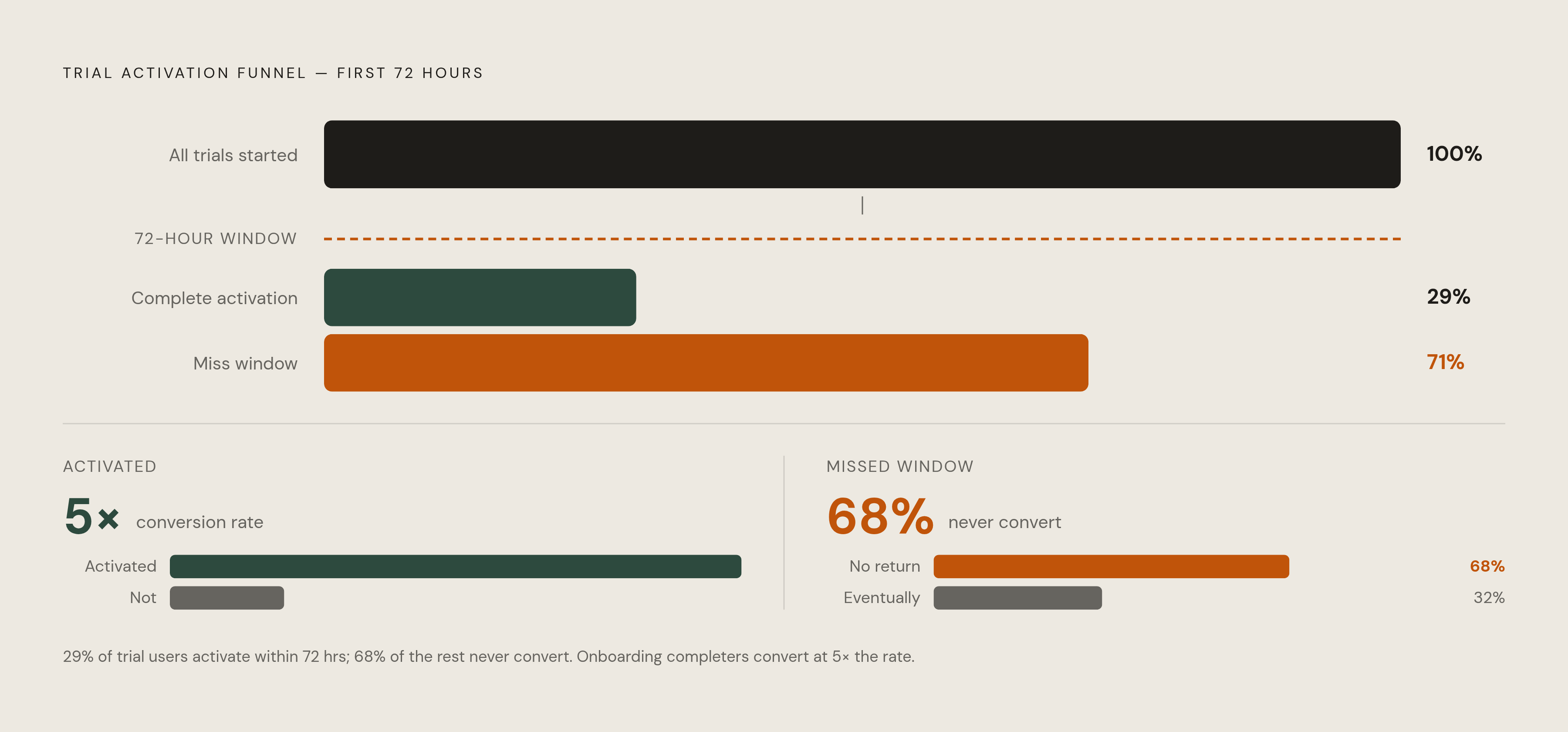
Mixpanel's 2025 Product Analytics Report identifies the single strongest predictor of conversion: whether a user hits the product's "aha moment" within the first 72 hours of signing up. Gainsight's Customer Success Index backs this up from the other direction; 68% of trials that fail to activate in that first 72-hour window never convert at all. Sit with that for a second. The urgency emails at the end of the trial get all the attention because they're the last thing standing before the deadline, but the data says the real leverage point is emails one through three.
And yet, Appcues' 2025 User Onboarding Benchmark found only 29% of trial users complete the activation sequence within three days. Why the gap between what matters and what happens? Most onboarding flows are built on a calendar, not on behavior. They send email three on day three no matter what the user did or didn't do, which is a bit like a doctor prescribing the same medication to every patient regardless of the diagnosis.
The typical B2B SaaS company activates 52% of trial users; the top quartile hits 65 to 75%. Intercom's research found users who complete an onboarding flow convert at 5 times the rate of those who don't. So the welcome and setup emails aren't pleasantries you send to be polite. They're the activation mechanism itself, and every sentence in them either shortens the distance to that aha moment or adds friction to it.
Worth defining that term precisely, because "aha moment" gets thrown around loosely. It isn't a feature. It's a felt outcome, something the user experiences for the first time and recognizes as valuable to them specifically. The sequence has to name that outcome explicitly in the early emails rather than assuming the user will stumble onto it alone, because most won't. That's not pessimism; it's just what the completion numbers above are telling us.
How to structure the full 7-email sequence before writing a word
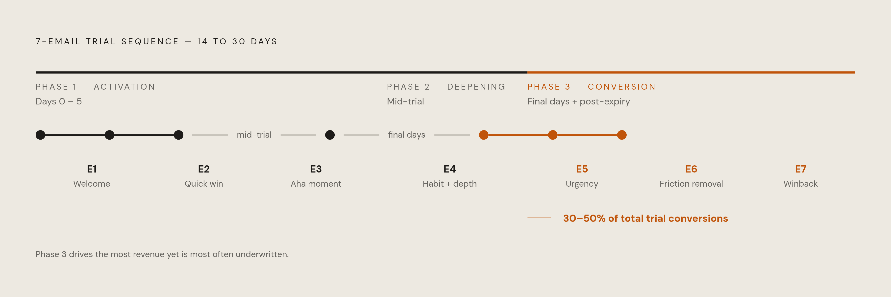
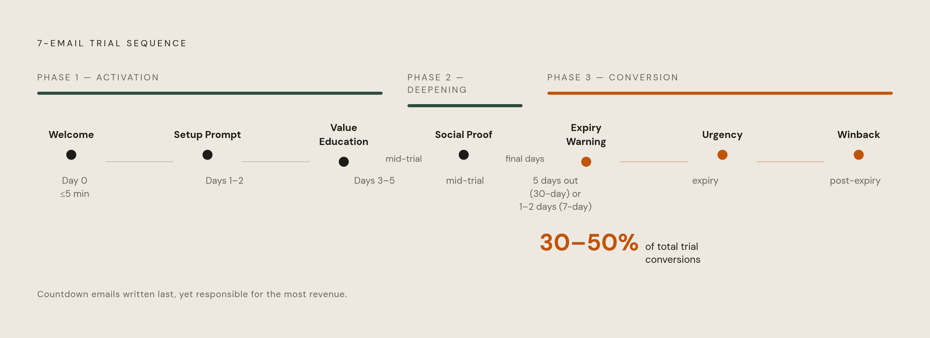
A trial sequence that works runs 5 to 8 emails, and for a 14 to 30 day trial, 7 is the number that shows up most often in practice. Before writing a single subject line, it helps to see the sequence as three phases, each doing something different.
Phase one is activation, days 0 through 5, and its only job is getting the user to the aha moment before the 72-hour window closes. Phase two is deepening, sitting in the middle of the trial, building the habit and introducing feature depth and social proof. Phase three is conversion: the final days plus whatever happens right after expiry, built to create urgency, strip out friction, and catch the users still sitting on the fence.
Here's the part that should embarrass most marketing teams: the countdown emails in phase three are responsible for 30 to 50% of total trial conversions, and they're usually the emails written last, in the last twenty minutes, with the least thought. That's backwards. If a third to half of conversions trace back to five days' worth of emails, those emails deserve more drafting time than the welcome message, not less.
One structural rule matters more than any subject line trick: behavioral triggers beat calendar-based sends. A time-based drip fires email N on day N regardless of what the user has done. A behavior-triggered sequence fires the next email when the user does, or conspicuously fails to do, something specific. Available data puts behavior-triggered sequences at 30% higher conversion than calendar-based ones. That said, teams without behavioral tooling shouldn't throw up their hands. A time-based sequence built on the stage map here still beats a single welcome email plus manual CSM follow-up. Don't let the absence of perfect infrastructure be the excuse for sending nothing structured at all.
There's a suppression rule buried in here that's easy to skip and costly to ignore: the sequence has to exit a user the instant they activate. Sending someone a "finish your setup" nudge after they've already finished setup doesn't just waste an email; it tells them the sender isn't paying attention, which undercuts every message that follows.
Four behavioral branches determine which path a given user takes. Activated users get a congratulations message paired with a nudge toward deeper feature use. Users who logged in but never activated get a friction-removal email that essentially asks what got in the way. Users who never logged in at all need re-engagement copy built around a different value angle than the one that didn't land the first time. And users who churn within 48 hours need an immediate winback message, ideally with a CSM offer attached.
Email 1 — Welcome (Day 0, within 5 minutes of signup)
Five minutes isn't a nice-to-have target here; it's structural. Welcome emails average a 50% open rate and outperform standard promotional email by 86%. That attention window is short and closes fast, and a welcome email arriving three hours later lands on a user whose mental context has already moved on to something else entirely, probably lunch.
The welcome email has exactly one job: confirm the decision the user just made, calm whatever anxiety came with signing up for something new, and hand them one clear action. It is not a feature tour. It is not the founding story. It is not a curated list of seventeen helpful resources nobody asked for.
The subject line should confirm the action, not celebrate the brand: something like "You're in, here's your first step" does more work than a subject line built around company pride. The opening line should acknowledge where the user actually is right now, not where the company likes to imagine itself. The body needs exactly one sentence about what they're about to be able to do, written in outcome language rather than feature language. The CTA is a single button, verb-led, tied to an outcome: "Set up your first report" beats "Get started," which is a phrase so generic it could belong to any product on earth.
Tone matters more than it seems like it should. Warm and direct wins. The enthusiasm spiral, the "We're SO excited you're here!!" register, reads as noise rather than warmth, and users can tell the difference even if they couldn't articulate why.
Leave out pricing, feature lists, social proof, onboarding checklists, and video walkthroughs. All of that belongs later. The personalization floor here is just first name, plus the specific plan or use case if the signup form captured it.
Email 2 — Setup prompt (Day 1–2)
Cap it at two emails in the first 48 hours: the welcome, plus this one. Send more than that early on and users learn to mute the sender, which quietly degrades every email that follows, including the ones that matter most.
This email exists to remove one specific piece of friction between the user and their first real success in the product. "Explore the product" isn't an action; it's a shrug dressed up as advice. The single most common reason users stall out is far simpler than most teams assume: they genuinely don't know what the first meaningful step is, so they take none.
The subject line should name the exact action: "Connect your first data source," not the vague "Getting started tips." The body should acknowledge, briefly, that setup can feel like a chore, then get the user past that feeling fast. If the setup task has multiple parts, a short numbered list of two or three micro-steps works better than paragraph description. Link to one help doc or one short video, never the knowledge base homepage, which is where good intentions go to die. The CTA should drop the user directly onto the setup screen, not the dashboard, where they'll wander like a tourist without a map.
If the user already finished setup before this email fires, suppress it entirely, or swap in a short "you're ahead of the curve" message pointing toward the next action. And the whole thing should read like a text from a colleague who happens to know the product cold, not like a notification generated by a system that's never met the user.
Email 3 — Value education (Day 3–5)
Four to five days is the right gap here, and that breathing room after email two isn't wasted time; it signals the sequence is intentional rather than a bot firing on a timer. This email's job is narrow: connect one specific feature to one specific outcome the user already cares about. The aha moment gave them a taste. This is the meal.
Feature education that doesn't tie back to an outcome the user named, whether during signup, in survey data, or in persona research, is just a changelog with better formatting. Open with the outcome, not the mechanism: "Most marketing teams using this for weekly reporting hit their first full dashboard within four days," then show which feature gets them there. One feature, one outcome, one CTA. Not a roundup, not a "here's everything we shipped this quarter" digest.
Keep it shorter than instinct suggests. If explaining the value takes more than 100 to 120 words, the feature is probably being explained wrong, not that the feature needs more words. If behavioral data shows what the user already did in the product, reference it directly: "Since you've already connected your first source, the next move is building your first dashboard." That's not personalization for its own sake; it's proof the sequence is actually watching.
Email 4 — Social proof (Mid-trial)
Why wait until mid-trial for this? Because social proof dropped into email one reads as a pitch. The same story, told in email four, reads as confirmation of something the user has already started to feel for themselves. Timing changes the meaning of identical words, which is a strange thing to sit with but worth sitting with anyway.
The job here is to show the user someone who looks like them getting a result they want. The case study has to match on industry, company size, or use case, or it just won't land; a 10,000-person enterprise story does nothing for a five-person startup reading it over coffee. Where segmentation allows it, different cohorts should see different proof entirely.
Lead the subject line with the result, not the brand: "How a 12-person agency cut reporting time dramatically" beats "Customer Spotlight: [Product] Story" by a wide margin. Keep the narrative to three or four sentences: the problem, the action taken inside the product, the outcome. One attributable, specific quote helps if it's available. The CTA should point the reader toward their own next action inside the product, not toward a case study PDF nobody's going to open.
Specificity is what separates proof from filler. "We saved time" does almost no persuasive work. "We cut weekly reporting from four hours to twenty minutes" does the job in one clause, because it's concrete enough to picture. Quantitative proof that maps onto the reader's own goals is about as persuasive as email copy gets; the writing just has to set the number up properly instead of burying it in the third sentence of a paragraph nobody finishes.
Email 5 — Trial expiration warning (5 days before end for 30-day trials; 1–2 days for 7-day trials)
Timing here is structural, not a matter of taste. A 30-day trial gets this email five days out, early enough to act, late enough that the urgency hasn't gone flat. A 7-day trial gets one to two days' notice, because there's no room for a gradual ramp-up when the whole trial barely lasts a week.
The job of this email is to remind the user what they stand to lose, not what they'll gain by paying. Loss aversion does more work here than any acquisition-style pitch, and it should reference the user's actual activity in the product: what they built, connected, or created, and the fact that all of it disappears on a specific date. Naming the exact things they'll lose turns an abstract deadline into something that feels like it's actually about them, which, at this point in the sequence, is really the whole point.